


Last verified September 2026
Richard Osei, Senior Health and Science Editor.
You know the shelf. Three, four, maybe seven palettes, most of them touched twice: once in the shop, once at home under a different light, when the shimmer that looked so promising suddenly reads chalky and the browns go muddy by lunchtime. The question you actually type into a search bar isn’t “best eyeshadow palette”, it’s closer to “why does this look nothing like it did in Boots”. The honest answer has less to do with the palette and more to do with light, skin oil, and a few things brands are very good at implying without quite saying. One fact worth knowing before anything else: the shop’s fluorescent or warm downlighting can shift a shadow’s undertone by a visible degree, which is why a colour that looks neutral beige at the counter can turn peachy or grey the moment you step outside. This piece is about learning to see past that, so you stop buying the same near-miss twice.
- Shop lighting lies more than the palette does, so a five-second daylight check before buying saves more money than any formula claim.
- Finish, not colour, decides whether a look reads flattering or ageing, because particle size controls how light bounces off the lid.
- Marketing words like “buttery” or “blendable” describe nothing measurable, whereas a simple swatch-and-swipe test tells you the truth in under a minute.
Why The Counter And The Mirror Never Agree

Shops light their counters to flatter stock, not faces. Warm downlights and fluorescent strips both push colour temperature away from daylight, sometimes by a noticeable margin. A taupe that looks perfectly neutral under a Boots display can read pink or grey once you’re stood by a window.
Think of it like paint chips. Nobody chooses a wall colour purely from the tester card under shop lighting, because everyone has learned that paint looks different once it’s on the actual wall at home. Eyeshadow deserves the same caution, and yet most of us skip the step because trying to check colour outdoors mid-shop feels awkward.
It needn’t. Swatch on the back of your hand, then simply glance at your phone screen, switched to camera mode with flash off, near the shop’s entrance or a window. That single glance under natural light will tell you more than the swatch under the counter spotlights ever will.
Finding Your Undertone In Daylight
Undertone is the quiet variable behind most disappointing purchases. Warm undertones sit better with copper, terracotta and golden browns; cool undertones lean towards plum, taupe and blue-greys; neutral undertones can generally wear both without a fight.
A simple self-test: look at the veins on the inside of your wrist in daylight. Greenish veins usually mean warm undertones, blue or purple veins usually mean cool, and a mix of both usually means neutral. It isn’t a laboratory measure, but it’s a reliable starting point that beauty desks at magazines including British Vogue have referenced for decades.
Once you know your lean, palettes stop being a guessing game. A warm-toned reader can walk past a beautiful cool-toned mauve palette without regret, because she knows it will fight her rather than flatter her, however good it looks swatched on someone else’s arm.
The mistake most people make is testing colour only against the back of the hand, which rarely matches the eyelid’s undertone exactly. If you can, test along the jawline instead, where skin tone is closest to the face you’re actually dressing.
Reading A Palette’s Finish Map
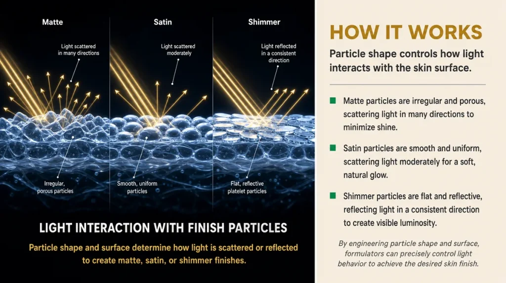
Every palette is really a mixture of finishes: matte, satin or silk, shimmer, and sometimes a foil or glitter topper. Finish, more than shade, decides whether a look reads polished or heavy.
The mechanism is simple physics rather than magic. Matte shadows have finer, duller particles that scatter light evenly, which is why they’re forgiving on mature or textured lids. Shimmer and foil finishes use larger, reflective particles that catch and bounce light in one direction, which flatters smooth lids but can settle unkindly into fine lines.
It’s rather like kitchen worktops. A matte laminate hides marks and doesn’t show every fingerprint under the light; a high-gloss or metallic surface looks glamorous but reveals every smear the moment the sun hits it. Eyelids behave the same way.
A well-built palette usually balances two or three mattes for shaping and blending against one or two shimmers for a highlight, rather than being all shimmer or all matte. If a palette is overwhelmingly foil and glitter, it will photograph beautifully but wear less kindly through a long day at a desk under office lighting.
Testing Pigment Properly, Not Just Swatching It
A swatch on the back of the hand under counter lighting tells you almost nothing about how a shadow performs on skin with natural oil and warmth. Pigment testing needs a second step most shoppers skip.
Swatch a colour with one single swipe of a finger, not three, then blow gently across it. If a fine dusting of colour lifts off, that’s fallout, and it will end up under the eye by mid-morning. Then wait thirty seconds and touch the swatch again. If it smudges rather than sitting put, the binder is too soft to hold its shape through a normal day.
A study published in 2023 in the Journal of Cosmetic Science measured pigment dispersion against binder ratio in pressed powder shadows and found that formulas with a higher proportion of binding oils to talc produced visibly less fallout, though at some cost to intensity on first application. In plain terms: a shadow that swatches instantly rich is often the one that scatters most on the face.
The honest test happens in one swipe, not three, and with a breath test straight after, not a wipe with a cotton pad.
Where The Marketing Language Stops Meaning Anything
Palettes are sold on adjectives: buttery, blendable, foolproof, twenty-four-hour wear. None of these are measurements, and none appear on an ingredients list.
“Blendable” usually just means the binder-to-pigment ratio is soft enough that edges melt into each other with a brush, which is a texture property, not a sign of quality pigment. “Buttery” describes the same softness from a different angle. Neither claim tells you anything about fallout, longevity or how the shadow will behave once body heat and natural oils get involved.
“Twenty-four-hour wear” is close to meaningless for eyeshadow specifically, since eyelids move, fold and produce oil at a different rate to the rest of the face. The Good Housekeeping Institute’s general guidance on cosmetics testing has long noted that wear claims are usually measured under controlled, static conditions rather than a working day of blinking, rubbing and warmth.
None of this means such palettes are poor value. It means the words on the box describe texture and marketing appeal, not durability, and the only way to judge durability is to wear the shadow yourself for a full day and note when, not if, it moves.
Judging Longevity And Fallout Honestly, At Home
The only fair test for wear happens on your own eyelids across an ordinary day, not in a shop mirror. Apply the shadow with no primer first, note the time, and check again after six hours in a normal mirror, in daylight if possible.
Damp winters and the dry blast of central heating common across British homes both affect how shadow behaves, usually pushing oilier lids to crease faster in heated indoor air and drier lids to look patchy without a primer underneath. If your results vary wildly between seasons, that’s the room, not a flaw in you.
Creasing along the lid’s natural fold is normal after some hours and isn’t a sign of a bad palette; heavy fallout under the eye within the first hour usually is. If a shadow needs a primer just to survive a morning meeting, that’s a fair thing to note before buying a second palette in the same finish.
A fortnightly habit worth building: wear one new shade a week without primer first, to learn how your own skin, rather than a swatch on a stranger’s arm, actually behaves with it.
Building A Working Palette From What You Already Have
Most drawers already contain the makings of a genuinely good palette, just spread across three half-used ones. Before buying another, lay out what you own and check whether you’re missing a transition shade, a definer, or a highlight, rather than another full set of twelve colours you’ll use four of.
Mixing across ranges and even across brands is entirely normal practice among make-up artists, who rarely work from a single palette. A neutral matte from one set can transition perfectly into a plum from another; there’s no rule that a palette must be used only as sold.
Many readers, particularly those who’ve learned to shop patiently, wait for the Boxing Day sales rather than Black Friday to top up basics, since the January restock at Boots, Superdrug and the Marks & Spencer beauty halls tends to bring genuinely useful neutrals on offer rather than limited-edition novelty sets.
The British Beauty Council has pointed out in its reports on the wider industry that a smaller, better-used collection typically outperforms a large one in both cost per wear and actual satisfaction, which tracks with what most make-up artists will tell you privately: three good palettes, properly understood, beat ten.
Key Takeaways
- Check colour in daylight, not under shop lighting, before you buy anything.
- Know your undertone from your wrist veins and test swatches along the jawline, not just the back of the hand.
- Judge finish by particle size: matte for forgiving coverage, shimmer and foil for smooth lids in good light.
- Test pigment with one swipe and a breath, not three swipes and a wipe.
- Treat words like “buttery” and “twenty-four-hour wear” as texture claims, not proof of performance.
- Wear a shadow a full day without primer at least once to learn how your own skin changes it.
- Build from what you own before buying more; three well-understood palettes usually beat ten new ones.
A Quick Checklist For The Counter
- Step towards a window or the door before deciding on a colour.
- Swatch once, then blow gently to check for fallout.
- Ask whether the palette balances mattes against shimmers, or leans entirely one way.
- Note whether you’re missing a transition, definer or highlight shade at home, or simply want a new tin.
- Wait for it to sit on your lid a full working day before judging it a favourite or a mistake.
This article is general information and does not replace advice from a qualified professional.
Individual results and skin responses vary from person to person.